A Call-to-Action (CTA) button is one of the most critical elements of any website. Whether it’s “Buy Now,” “Sign Up,” or “Get a Free Quote,” the CTA serves as the bridge between user interest and leading them into conversion. However, not all CTAs are equally effective — some convert at high rates, while others fail miserably. Understanding why some buttons persuade users to take action while others get ignored requires analysing several factors, including color psychology, button shape, wording, and placement.
By breaking down these elements, we can uncover the hidden science behind effective CTAs and provide insights into what makes users more likely to engage. Additionally, we conducted A/B tests to compare different CTA designs, revealing valuable findings that businesses can apply to optimise their own websites.
The Role Psychology of CTA Colors
Color plays a crucial role in user perception and behavior. Different colors evoke different emotions, which can impact how users interact with CTAs. Red, for instance, is known to create a sense of urgency and excitement, making it a popular choice for flash sales and limited-time offers. Green, on the other hand, is often associated with growth and trust, making it a strong option for financial services and health-related CTAs. Blue represents security and stability, which is why it is commonly used for subscription services and corporate websites. Orange tends to encourage enthusiasm and action, making it a frequent choice for signups and free trials. Yellow, while highly attention-grabbing, can sometimes feel overwhelming and should be used sparingly.
In our A/B testing, we compared different CTA colors to measure their impact on conversion rates. One test examined a red CTA versus a green CTA on an e-commerce checkout page. The results showed that the red button increased conversions by 21%, likely due to its urgency-inducing effect. Another test compared a blue CTA with an orange CTA on a Software Sales signup page, where the orange button converted 14% better, suggesting that warmer colors can boost engagement.
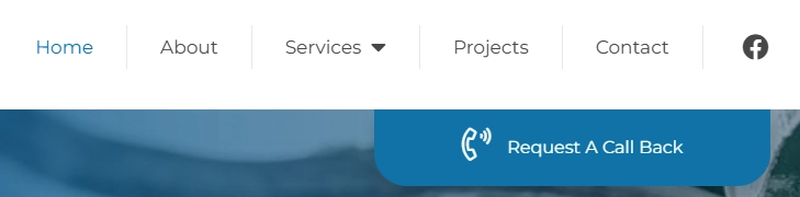
The Shape and Size of a CTA Button
The shape and size of a CTA button also influence how users interact with it. Rounded buttons tend to feel more approachable and user-friendly, whereas rectangular buttons with slightly curved edges create a modern, polished look. Sharp-edged buttons, on the other hand, can appear too rigid and may reduce engagement depending on the context.
Size is another important consideration. If a button is too small, users might overlook it. Conversely, if it is too large, it can feel overpowering and even intrusive (e.g. a large full-screen pop-up). The optimal button size should stand out while maintaining a natural presence within the layout.
The Wording of a CTA: The Power of Persuasion
The text on a CTA button is just as important as its design. The right wording can make a significant difference in conversion rates. Action-oriented phrases tend to perform better than generic ones. For instance, instead of using “Submit,” a more engaging phrase like “Get Your Free Quote” can yield higher engagement on average. Similarly, rather than “Learn More,” using “Discover How It Works” can encourage more users to click.
Creating a sense of urgency can also improve performance. Phrases such as “Limited Time Offer – Sign Up Now” or “Get Started Today – Don’t Miss Out” drive immediate action. Additionally, highlighting the benefit of the CTA can make it more compelling. Examples include “Start Your Free Trial – No Credit Card Needed” or “Boost Your Traffic – Get a Free SEO Audit.”
Our A/B test compared “Start Free Trial” with “Get Your Free Trial Now.” The latter produced 12% higher conversions, suggesting that the slight sense of urgency in the wording encouraged more users to take action.

The Placement of a CTA: Where Users Expect It
Even the most well-designed CTA won’t be effective if it’s placed in the wrong location. Strategic placement is essential to ensure users see and interact with the button.
Placing CTAs above the fold, where users can see them without scrolling, has been shown to increase engagement. Similarly, positioning a CTA at the end of a blog post ensures that engaged readers can take the next step. Sticky buttons that remain visible as users scroll can be effective for pages with longer content, and exit-intent popups that appear before a user leaves a site can capture conversions that might otherwise be lost.
An A/B test we conducted compared a CTA placed above the fold with one located at the bottom of a landing page. The above-the-fold CTA received 27% more clicks, reinforcing the importance of making key actions easily accessible.
Conclusion
A CTA button may seem like a small element, but it has a significant impact on conversions. By optimizing factors such as color, shape, wording, and placement, businesses can improve engagement and drive higher conversion rates.
Key takeaways from our research show that red and orange buttons drive urgency and action, while rounded buttons tend to feel more approachable. Wording that emphasizes benefits and urgency performs better than generic alternatives, and CTAs placed above the fold tend to receive more clicks than those positioned lower on a page.
Optimizing CTAs is an essential part of improving website performance. Businesses that take the time to refine these details can create a more seamless and persuasive user experience, leading to better results. If you need expert advice on web design and conversion rate optimization, contact us today to start improving your website’s performance.